 Text Tools
 Image Tools
 CSS Tools
 Coding Tools
 Color Tools
 Social Media Tools
 Miscellaneous Tools
 Add to Chrome
 Add to Firefox
CSSanimation-timing-function: linear;
animation-duration: 1s
Similar CSS Tools


What is Online CSS Cubic Bezier Generator?
CSS Cubic Bezier Generator is a free online tool for generating CSS code for cubic bezier easing functions by getting info about the animation from time vs progress graph or directly previewing the animation.
When creating animations on web development, mostly linear transitions are used since most animations are very short and users may not feel the difference between a linear CSS animation and an animation which has an easing function. But, if you are working with complex animations which has a duration above ~0.5s, it is important to use more natural easing functions or elastic movements which attracts users more. There are predefined easing functions in CSS which can be used for better animations which are ease, ease-in, ease-out and ease-in-out. When these easing types are not sufficient, best way to manage an animation timing in CSS is to use Cubic Bezier easing functions.
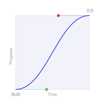
There are 4 parameters in CSS cubic Bezier animation timing function which defines the positions of 2 points, P1 & P2. First point P1 identifies the progress at the start of the animation while P2 identifies the final part. Cubic bezier curve is defined in coordinate system starting from point (0,0) to point (1,1). The path between these points describes the progress of the CSS animation.
- x1, y1: x and y coordinates of P1 (Point 1) which defines start of animation.
- x2, y2: x and y coordinates of P2 (Point 2) which defines end of animation.
By defining x and y coordinates of these 2 points, you can define the progress of all animation with cubic Bezier function in CSS. x values are limited between 0 and 1 while y values may be between minus infinity to plus infinity. But, in terms of achieving natural animation progress, it is limited between -2 to +2 in the tool.
How to use Online CSS Cubic Bezier Generator?
You can generate CSS code for cubic Bezier animation timing functions by following these easy steps.
- First, you have to select 4 coordinates for constructing the cubic Bezier starting and ending points.
- Animation can be previewed online by pressing the play icon. If the result is not satisfactory, you can fine tune it easily by changing the coordinates. Also, the graph is helpful to predict the CSS animation progress. Its path and slopes give ideas about the result.
- Default animation duration is one second, but you can change it between a range from 0 to 5 seconds. Also, predefined CSS animation timing functions can be selected from the list see how they behave.
- CSS code or cubic Bezier coordinates can be copied and used in your project by just pasting it in your stylesheet.