 Text Tools
 Image Tools
 PDF Tools
 Social Media Tools
 Security Tools
 Coding Tools
 CSS Tools
 Color Tools
 Miscellaneous Tools
 Add to Chrome
 Add to Firefox
The 8-value elliptical form, the one that makes organic blob corners rather than a plain rounded box.
CSS Codeborder-radius: 25% 25% 25% 25% / 25% 25% 25% 25%;
What is Online CSS Border Radius Generator?
CSS Border Radius Generator is a free online tool for generating CSS border radius. "border-radius" is one of the most used CSS properties to soften corners of HTML boxes. If you use equal border-radius on all corners, it is relatively easy to apply, and you don't need any helper tool to set it. Even most developers don't know, CSS border radius may take arguments up to 8, 2 for each corner and each one determines slope of each axis of the corner. By setting all these 8 parameters, you can use CSS border-radius property in a more professional way to mask colors, images, and html elements.
You can either use standard CSS units like pixel (px), rem, em or percentages for border-radius. Percentages will be used in this tool to represent a more general solution, but you can convert them to standard units by your own if you prefer.
Here is a representation of an advanced usage of border-radius for masking an image. By settings border-radius of each corner individually, it is possible to obtain artistic results with images, gradients, or event with solid colors.
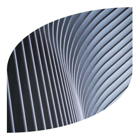
There are 2 main options for settings radius of each border. By default, there are 8 dots to set, 2 for each corner. If you enable "Merge Edge Radiuses" option, number of dots will reduce to 4 and each dot will control 2 radii at the same time. This option is better for setting more curvy shapes.
How to use Online CSS Border Radius Generator?
You can generate CSS code for border-radius property by following these steps.
- Set the positions of each dot by dragging them to desired positions.
- There are 3 preview types. Solid color, gradient, or image. You can preview border-radius in each mode, either with guides or by hiding them with "Hide Guides" option to see result.
- Width and height of the image can be set if you need.
- If you want to merge edge radiuses, you can enable this option to control 2 neighbor radiuses with one dot.
- If you get the desired result in preview, you can copy the CSS code by clicking "Copy" button and paste it in your project's styles directly.
Frequently asked questions
Why would I need a tool for border-radius?
For one equal value you would not. It earns its keep on the long form — eight values setting a horizontal and vertical radius per corner, which is how you get organic, uneven blob shapes. Writing that by hand is guesswork.
What does the slash in the value mean?
It separates horizontal radii from vertical ones. Everything before the slash sets the horizontal radius of each corner, everything after sets the vertical. That mismatch is what makes a corner elliptical instead of circular.
How do I make a perfect circle?
border-radius: 50% on an element with equal width and height. On a rectangle the same value gives an ellipse, which is often what you actually wanted.
Does border-radius clip the content inside?
Only if you ask it to. Backgrounds and borders follow the curve, but an image inside can still poke out of the corner — overflow: hidden on the container is what tucks it back in.
Can I animate it?
Yes, and animating the eight-value form is how those slowly morphing blob shapes are made. The CSS Clip Path Generator is the alternative when the shape needs corners rather than curves, and the CSS Triangle Generator covers the one shape CSS makes awkwardly.