CSS Codeclip-path: polygon(50% 0%, 100% 100%, 0% 100%);
Similar CSS Tools
What is Online CSS Clip Path Generator?
CSS Clip Path Generator is a free online tool for generating CSS clip path for masking your images. "clip-path" is a CSS property for restricting the boundaries of an image by predefined rules. It gives you flexibility to obtain image masks just by using CSS. You can obtain image background transparency with JPG file type partially with this feature without using PNG and make an indirect image optimization.
There are 4 different clip-path types, polygon, circle, ellipse and inset. Most widely used CSS clip-path type is polygon. You can put as much dots as you want to obtain a polygon and this shape will be used as a reference to you image mask. There are many geometric polygon shapes are available in the tool to use as a template to obtain the desired clip-path. They are varying from simple geometric shapes to more complex structures.
CSS clip-path property can be used for different purposes. It is mostly used in landing page and hero images as image mask. We can say that it works as a CSS shapes generator. It is not mendatory to use an image as background. You can use css clip-path property with solid backgrounds or backgrounds with gradients. Also, you can use clip-path to shape your section separators. It is a common trick to use CSS clip-path to obtain diagonal section separators. It is better to use SVG mask for complex shapes like waves, curves, etc., but online CSS Clip Path Generator will be suffucient if the shape is simple.
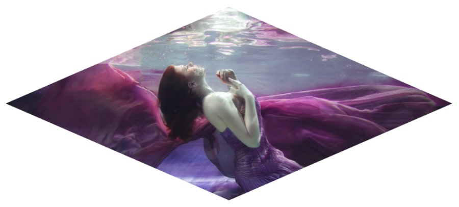
Here is an artistic image that is clipped with CSS clip-path. It looks more aesthetic than the raw image in your UI (user interface) design and webpages for most cases and it's a relatively low-cost operation.

How to use Online CSS Clip Path Generator?
You can generate CSS clip-path code with the help of the instructions below.
- Select the shape you want to use as a template for your clip-path.
- You can either use placeholder images or your own background image by setting its URL.
- You can change the width and height of the preview image. Be careful, since clip-path coordinates are given in percentage, aspect ratio of the image is more important than the width and the height.
- Move the dots to change the path as you need by dragging them. When you get the desired result, you can use "Hide the guides" option to see the final result.
- If you get the desired clip-path, you can copy the CSS code to your clipboard and paste into your web project.
Credits
Images used under the clip path for preview purposes are served by unsplash.com.